
There’s no doubt that inbound marketing strategies are critical to the success of today’s businesses. However, traditional outbound strategies can still play a role in capturing your audience’s attention.
B2B companies can drive buyer awareness and action with print advertising in highly targeted industry publications, but without good design, ads can go unnoticed.
The Launch team reviewed several ads in a recent issue of Laser Focus World magazine and graded each based on design and effectiveness. Read on to learn which ads stood out for our team, which fell short, and how you can improve ad design for your brand.
Simplicity Wins

Grade: A
What’s Right:
- Prominent logo with large, easy-to-read print
- Clearly identifies product for sale
- Simple communication of differentiators
- Not crowded with specs
- Simple, colorful image (though pixilation seems out of place)
What’s Wrong:
- Missing a call to action
- Horizontal color bar disrupts the flow of the ad and seems unnecessary
A Little Fun Goes a Long Way

Grade: B-
What’s Right:
- Eye catching photo with a tagline that fits the product – stands out in a industry publication like Laser Focus World
- Clearly identifies product for sale
- Excellent call to action – leads to a simple video demonstrating product use
What’s Wrong:
- Lack of white space – ad is too busy
- Lengthy, narrative text – would be great for a larger ad but gets lost in this 1/3 page format
- Logo too small
- Top and bottom portions of ad lack visual cohesion – color and font difference almost makes it appear to be two ads
Yes, Size Matters

Grade: C (as a full page ad, this would be a solid A-)
What’s Right:
- Prominent company name
- Clearly identifies product for sale
- Simple, colorful image
- Not crowded with specs – those included are in bullet form and kept simple
What’s Wrong:
- Text barely readable – ad appears to have been designed to fit a full page format but was used in a 1/3 page size
- Fax number – skip the old-school fax number and include a CTA instead
- Web address too small
Altering the design to fit the chosen ad size would have required minimal effort and retained the positives of the ad.
Everything But The Kitchen Sink
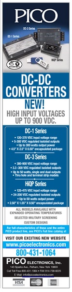 Grade: D
What’s Right:
- High quality product photo, though the size is too small
- Clearly identifies products for sale
- Logo is prominent
What’s Wrong:
- Way, way, WAY too much text
- Drowning in detail – focus instead on the call to action, send readers to the web to review specs
- The days of listing fax numbers and credit cards accepted are long past
- Too many color bars
- Not enough product imagery – an alternative layout would allow for a larger photo or a vertical line of product photos instead of a group shot